Zerotude
Zerotude's mission is to create better buildings for better lives through faster renovations.
Details
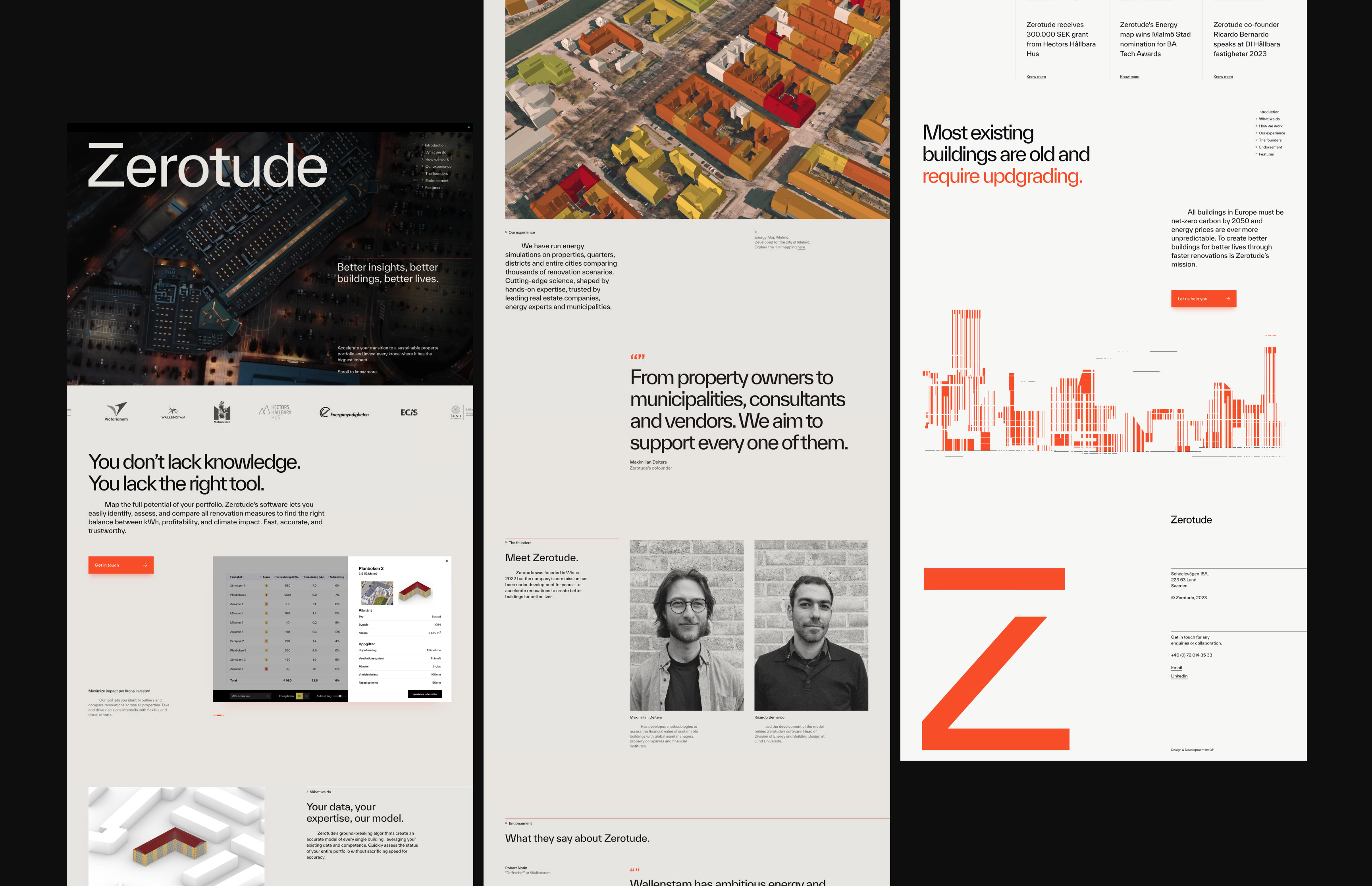
Zerotude is a start-up dedicated to enhancing living standards through accelerated building renovations. Its target audience spans property owners, municipalities, consultants, and vendors.
Leveraging innovative software and a groundbreaking algorithm, Zerotude excels at identifying, evaluating, and comparing renovation options, achieving an optimal mix of energy efficiency, profitability, and environmental impact.
I was invited by Zerotude's founder to contribute to the development of their visual identity and digital touchpoint, crafting an engaging and informative website. Through weeks of close collaboration, we created a minimalist visual language centered around a new wordmark, a monogram, a vivid color scheme, and a series of illustrations.
The outcome successfully aligned with the founder's vision for a progressive aesthetic and established a clear online platform for engaging and educating potential clients.
↗ Live SiteLeveraging innovative software and a groundbreaking algorithm, Zerotude excels at identifying, evaluating, and comparing renovation options, achieving an optimal mix of energy efficiency, profitability, and environmental impact.
I was invited by Zerotude's founder to contribute to the development of their visual identity and digital touchpoint, crafting an engaging and informative website. Through weeks of close collaboration, we created a minimalist visual language centered around a new wordmark, a monogram, a vivid color scheme, and a series of illustrations.
The outcome successfully aligned with the founder's vision for a progressive aesthetic and established a clear online platform for engaging and educating potential clients.
Year
2023
Type
Personal Work
Client
Start-up
Role
Visual Identity
Digital Design
Illustration
Motion Design
Webflow Development
Digital Design
Illustration
Motion Design
Webflow Development

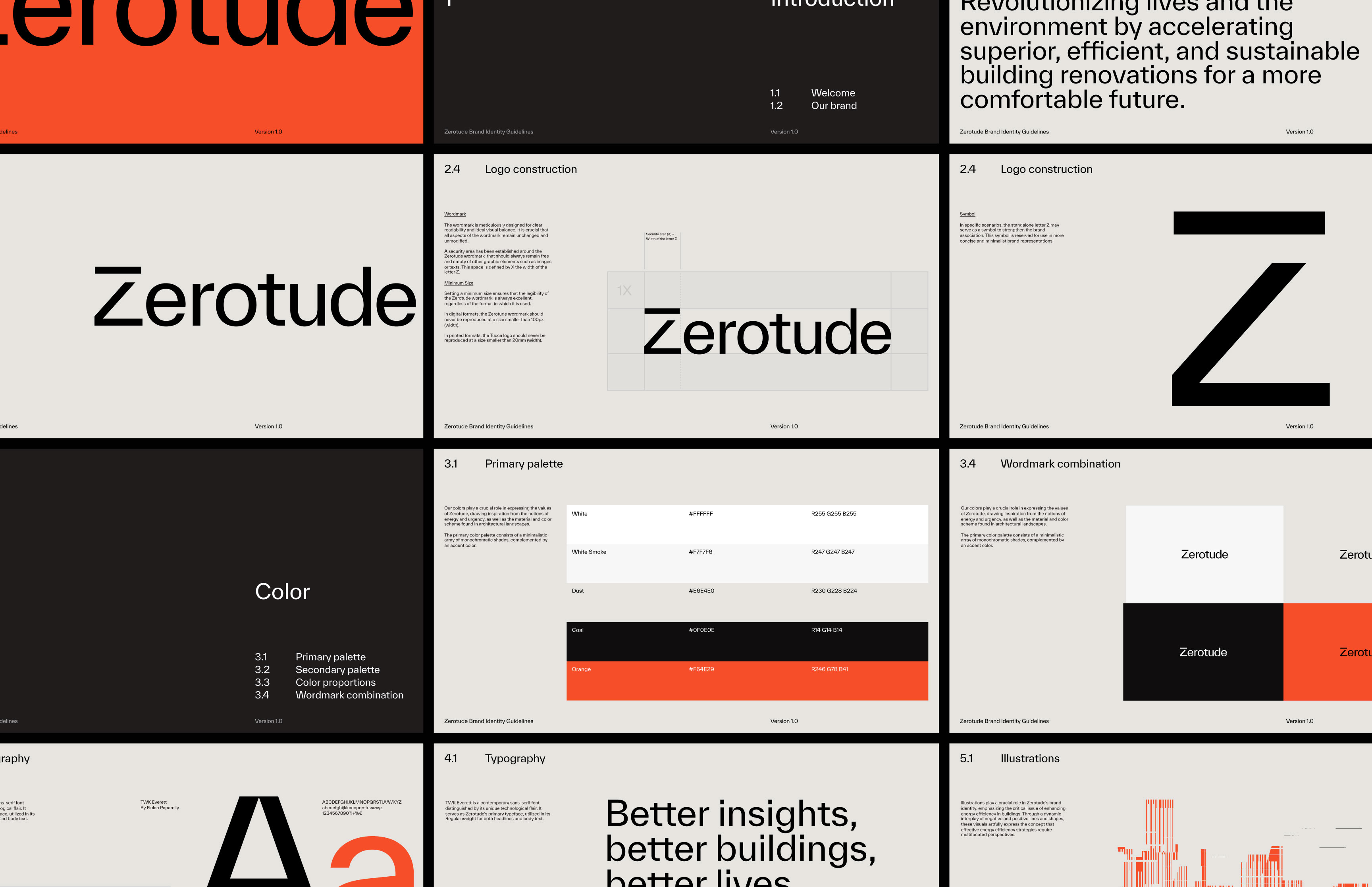
— Typeface
We selected TWK Everett as Zerotude's corporate typeface. A concrete sans-serif with a pronounced technological flair, created by Swiss graphic and type designer Nolan Paparelli.
We selected TWK Everett as Zerotude's corporate typeface. A concrete sans-serif with a pronounced technological flair, created by Swiss graphic and type designer Nolan Paparelli.

— Color
We selected a palette of tones inspired by construction materials, serving as a neutral background. To convey a sense of urgency regarding the matter in question, a bright orange tone was crafted as the accent color and primary hue identifier for Zerotude's visual language.
We selected a palette of tones inspired by construction materials, serving as a neutral background. To convey a sense of urgency regarding the matter in question, a bright orange tone was crafted as the accent color and primary hue identifier for Zerotude's visual language.

— Wordmark
The wordmark, derived from Zerotude's main typography, underscores the company's direct and practical approach to addressing energy efficiency challenges in both public and private properties.
The wordmark, derived from Zerotude's main typography, underscores the company's direct and practical approach to addressing energy efficiency challenges in both public and private properties.


— Monogram
Zerotude's monogram is an integral component of the wordmark, yet in specific instances, it can also function as a standalone graphic stamp. With a "less than zero" symbol subtly embedded in its reductionist design, it straightforwardly communicates Zerotude's primary objective.
Zerotude's monogram is an integral component of the wordmark, yet in specific instances, it can also function as a standalone graphic stamp. With a "less than zero" symbol subtly embedded in its reductionist design, it straightforwardly communicates Zerotude's primary objective.

